Thursday, June 13, 2013

Shaintar Mage

Here is number three from my Shaintar Archetypes.
This time around we have the spellcaster, wielding a staff in a defensive posture as she is about to cast a spell. I wanted to get away from the classics here, and rather then show the old tired Gandalf clone, I made the character into a young woman, stern and capable, and standing in front of a university of arcane teachings. The building is almost church like in structure, to show the reverence its halls contain for ancient knowledge.

Wednesday, June 12, 2013

Shaintar Fighter

This is the second of my Shaintar character archetypes series, and features the fighter. He's a little world weary, which is reinforcing the more realistic angle I was trying for with this project. After all, after years of roaming around the world as a mercenary, killing and marching, marching and killing, life is a brutal place for a professional soldier. I also gave him a rather mixed assortment of gear and clothing, to show that he has travelled far and mixed and matched available armor.
 

Tuesday, June 11, 2013

Shaintar Rogue

As part of the Shaintar project, I created four separate images for each iconic rpg class. The Rogue, Fighter, Cleric, and Mage. They were all a lot of fun to conceive, and I tried to do something different for each of the backgrounds, putting the characters in an environment that seemed to reinforce their chosen profession.
This is the image for the Rogue, which shows him silently crossing a river at night by boat, to avoid any night sentries. The knife hes holding is a little on the hammy side (is he going to jump out of the boat and backstab a fish?) but it seemed like the easiest way to show his nefarious intent.


Monday, June 10, 2013

Downfall character designs

 
These are a few of the cocnepts that I came up with for the original funding campaign, that have since made their way into the story of the first book.


Sunday, June 9, 2013

Elindria the enchantress

This is another one from the NPC Codex. The only girl in the bunch, she is an Elf Sorceress.
She is probably the most arch typical of the characters I did for the book, which is why I wanted to show her as a bit more rugged and less whimsical. For example, I even gave her pants and a sword! but in the end, I couldn't resist the urge to give her a cartoonishly large bust. I guess I can only do so much before my years of training in traditionalist fantasy art take over.
 
Also, the color use on this one was a bigger challenge then usual. As with all my Paizo character work, I try to use Wayne Reynolds Iconic characters as a kind of springboard for style, and visual brand, as there are few games in the genre so defined by one artists specific look as Pathfinder. But in this case, one of the basic iconics done by Wayne is a female sorceress, so I wanted to make this one as distinct as possible, but still include some subtle cues to make her similar. Which sounds completely contradictory right? well, therein lies the challenge. So I made her a lot more rugged where Wayne's character was more womanly (AKA, less clothing) and I gave her blues and greens, where the iconic sorceress is dressed in an orange-red color.


Saturday, June 8, 2013

Downfall promotional pieces


a couple of Downfall promotional pieces done in a more cover art style. Probably going into the book as chapter cover art.

Friday, June 7, 2013

Darkstar

Another character from the NPC Codex, this one is a Halfling Rogue Shadowdancer. This guy was a fun design, cool helmet, duel swords, dark grey outfit, but it's always a tricky balance when doing a character in dark colored armor, as to how dark everything gets before you start to lose details. So I tend to keep my color range pretty conservative, painting in pretty much all the detail anyway, in more of a medium range, and then darkening things down afterwards so I lose as little detail as possible.  


Thursday, June 6, 2013

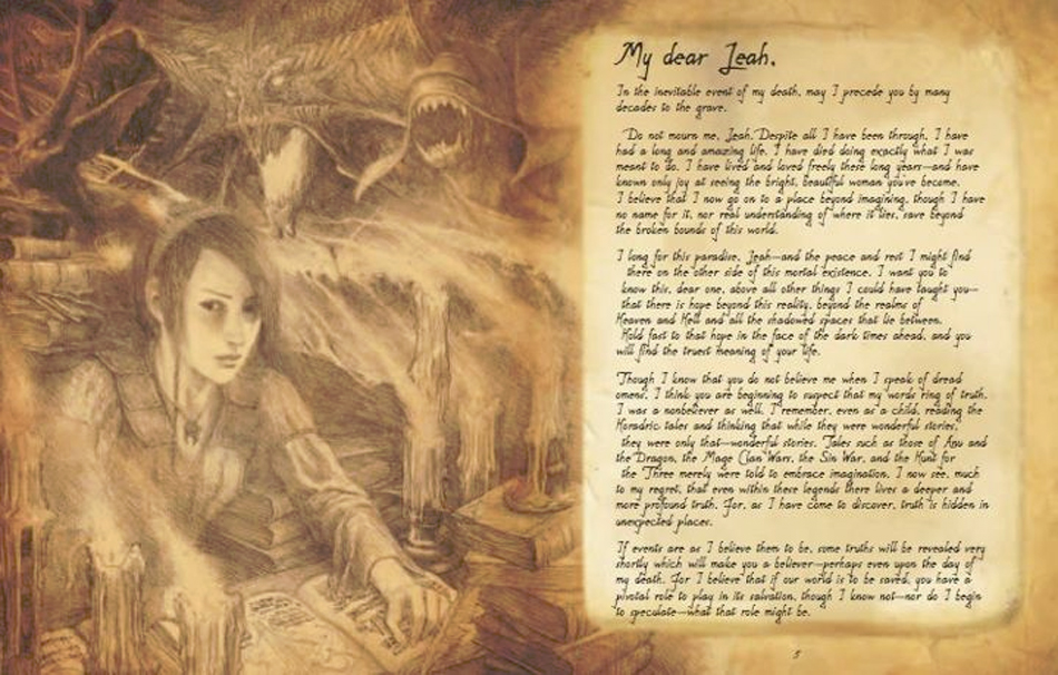
Diablo III: Book of Cain Review

Published by Insight Editions in December of 2011, this obviously isn't a new product. It isn't even technically an art book, it's really more of a promotional product for Diablo III, that just happens to contain a lot of art. And what art it is. A collection of modern masters, plying their trade in pencil rather then paint, and done on a parchment colored paper, with textured edges for that extra feel of aging, and impeccable graphic work and layout, this is a rich history book for a world from a video game franchise, oozing flavor from every page. But with a presentation and art of this caliber, it is so much more impressive then just a video game book, and deserves recognition alongside some of finest collectors art books today.

Contributing artists include:
Brom
James Gurney
Mark Gibbons
John Howe
Joseph Lacroix
Alan Lee
Victor Lee
Iain McCaig
Petar Meseldzija
Jean-Baptiste Monge
Adrian Smith

It can be found on amazon here and I can't recomend it highly enough to anyone who appreciates pencil based fantasy art, or anything at all in the dark fantasy genre of art, this is one hell of an art book (see what I did there? Hah!)


Wednesday, June 5, 2013

Downfall graphic novel world design


I really enjoy the gritty atmosphere this kind of world allows, and rendering the ruins of cities and cracked and broken details has been a ton of fun. We're drawing a lot of inspiration for this setting from the classics of the genre, but I'm getting to design everything from the ground up within the style that we've set for the book. It's the kind of production work I've done a few times, but never for this kind of world or in this kind of illustration style, so its been a real journey of discovery.


Tuesday, June 4, 2013

Brother Night

 This was one of the characters I was assigned for the NPC Codex, a Pathfinder roleplaying game book. The book itself was a pretty mammoth undertaking (for Paizo anyway, not me, I only had to do 6 characters for it), and the huge number of characters included is impressive, but the quality of the art in the book is even more outstanding. Not every image is perfect mind you, but overall, it sets a high standard for a book with hundreds of full body character images. It's like a bestiary for NPC's, and not somthing I've seen on this scale before.

Also, it was a cool project to be a part of, because the characters were all unique, interesting, and unusual. So often fantasy art is a matter of creating a variation on a well worn archetype, and these characters are definitely not archetypes. I will be posting my work for this book over the oming days here, and first off is the orc shadow dancer bard assassin. I'm not sure what the official classes ended up in the final product by the way, I'm just listing the character backgrounds as they were given to me, so you can identify why I drew them as I did. They may have changed throughout production to something else entirely, this orc may be published as, say, a duel knife wielding janitor in the final printed book.


Monday, June 3, 2013

Downfall graphic novel promo issue


Before launching our kickstarter for the Downfall project last year, we put together a little 10 page promo issue to test the waters and really show people the comic we wanted to make, albeit in a very small slice of the world. But it was enough fun to create and such a departure from my usual work, that I thought I would put it on here and talk a bit about the process.

 
The first page was easy. I'm an illustrator after all, and doing a full page, establishing shot is the kind of thing I've been doing for years. So this was the first piece I worked on, and easily the fastest from start to completion. I knew it needed to really encompass the world and its themes, but still read easily. So this is where I decided to do the classic post apocalyptic wasteland, broken buildings and scattered signs of a civilization long gone.

The second page was a little trickier, as I had to show the character close up, and set the scene, and show the alien in just a few panels. The alien by the way was a fun creature to design, and I will be getting to draw them quite a few more times throughout the rest of the story.


Sunday, June 2, 2013

The Skillful Huntsman review

Published in 2005 by Design Studio Press, this book is an interesting experiment in art book publishing. For 14 weeks an instructor at Art Center College of Design in Pasadena, Scott Robertson, gave his students a project to create original designs and concepts for a world based around a Brothers Grimm story, namely, the Skillful Huntsman. This book is the collection of art that came from that project.

The actual Brothers Grimm fable is not very long, this book actually begins with the original story, and it only takes up a two page spread from start to finish. The remainder of the 160 pages are filled to the brim with an excellent collection of concepts for characters, props, environments, and everything in between.
This book is an excellent education in variety, and the core principles of concept design, and is one of the best published resources for anyone looking at a career in entertainment concept art. It's also just plain fun art, with wild experimental ideas from cover to cover, and a great resource for any artist.

The artists featured include:
Khang Le
Mike Yamada
Felix Yoon

Every one of them has since gone on to a pretty sterling career in video games and movies. These are gifted, world class artists at the very beginning of their careers, showing the kind of work they produced when they were still students themselves. As far as educational and career beneficial art books go, this is one of the best available.


Saturday, June 1, 2013

Personal work, Peril

This one took me quite a while to finish. Yes, its super simple, but sometimes its the simple ones that take the longest. You see, my personal work is an exercise in creative development of an image in the most organic way possible. Yes, I do sketches and thumbnails beforehand to find the basic shapes that inspire an image, but I rarely stick to them as I do with my professional work. These images are about putting down the basic pieces, and then finding my way to the finish line by trying new things, and there is never a set amount of time for that kind of process. Sometimes its easy and everything falls into place on the first try, and sometimes I feel like I'm chasing a rabbit in the woods, I keep adding elements, taking them away, trying something totally different, playing with different colors, even flipping the image in different directions or changing the sizes of the elements I like to see if they fit into the whole image better a different way. It's always a unique wall to climb, and always an experiment in creativity. This one went through many different versions, and I even thought it was finished a couple times, but I just wasn't quite happy until now.

Friday, May 31, 2013

Downfall graphic novel character design


Downfall is my first real project in the world of sequential storytelling. It has been a lot of work so far, and over the past year has proved to be quite a balancing act with the rest of my projects and commission schedule. But it is finally starting to come together, and while there is still a lot of ground to cover before its complete, I want to start offering some sneak peaks at the work that is going into the book.
 
To start with, there are two main characters in the story, and here are the initial sketches for each of them, and the rendered color finals.


Wednesday, May 29, 2013

Legend of the Five Rings sketches


Some of these are from the recent sets, some not. I just haven't shown them anywhere before, so this is as good a place as any to show how this work started out. Are they all works of genius? probably not. But they are some of my personal favorites from recent years. As you can probably tell I develop them to different levels of completion in this stage, and I would like to say its an artistic choice, something done for the needs of the individual image. But really its just how much time I had to devote to the sketch phase of each piece. And how confident I am in the art director not asking me to make huge changes to the image.


Monday, May 27, 2013

Some sketches from conventions


This is something I'm calling the King of Swords. This is one of those sketches that really probably wouldn't have happened if I was at home in the studio, looking to do something original, or practical, or super artistic. Its inspired by a kind of symbolic, iconic look that you might see on playing cards, or Taro cards, just kind of graphic and basic. You know, the kind of thing that can be drawn while doing fifty things at once, which is how it can sometimes feel to be running a booth at a convention.

 
This is another sketch that was just a matter of streaming consciousness when most of that consciousness is engaged elsewhere. I was always a big fan of Conan art, and Frazetta's work in general, so a lot of the time at conventions I find myself drawing barbarians and giant monsters, or like this one, armored dangerous looking characters that bear more then a passing resemblance to the Death Dealer character Frank made so popular. It's a well I've visited more then once, but when it's a fun place to visit I say go for the fun stuff whenever possible.

Sunday, May 26, 2013

Shaintar: Legends Arise players guide

Way back in 1998, I was still working at a company that did most of its business with websites and marketing. So it was an exciting time for me, because I was getting my career off the ground. But the problem was, it was the wrong career. I never really wanted to do graphic design, though it was fun, it never really got my juices flowing the way fantasy art did. Or does.
Anyway, lucky for me, this company was made up of other people who had a great love for games and the game publishing business, so we decided to split our efforts between the websites and corporate work, I.E. "stuff that actually pays a paycheck", and creating roleplaying game books.
So we devoted as much time as we could justify to the creation of our first game book, hired a full time game writer named Sean Patrick Fannon, and a year later, we published our first book to great industry acclaim.
 
But eventually the reality of the business caught up with us, and the costs of publishing in such a niche business, and we sold the game publishing side of our company, and moved on. I went into freelance, others found jobs with other marketing companies.
 
Sean Fannon however, has stayed very much a part of the gaming business ever since, and the world he had created and shaped for many years is something he has continued to pour his heart and soul into for all the years since that time.
 
He has finally managed to craft a definitive version of his world using the Savage Worlds rules system, and will soon be launching a kickstarter campaign to help fund the main world book.
When I heard he was finally taking his project back to market, I knew I wanted to help as much as possible. So I contributed as much art as I could to the initial product, the Players Guide, which will serve as an introduction to his world, and a sampling of the much bigger project still to come. It's free, so go grab a copy.
 
Anyway, on to the art.
When I get a chance to work on passion projects, which is a true rarity these days, it is something I tend to relish quite a bit. I try to use it as an opportunity to try new things, and experiment with ideas and styles I've not used before, but always wanted to try.
 
For this project, I knew Sean had a lot of basic, fantasy style character art. Which has been a very popular way to illustrate fantasy RPG's for the last few years. But that meant he had almost no scenes from the world itself, something that is really a necessary part of any good setting book. So I used it as an opportunity to brush up on my landscape skills, which I don't get many chances to use these days.
And in order to create a look that fit with the other work in the book, they had to be done in pencil, which made it an even more unusual project. In the end, I did kind of cheat by adding a lot of texture, shading and detail onto the sketches digitally, but I think it still fits into the pencil style pretty well.


Spectrum Live 2


The second time as it turns out is even better than the first. I don't have the official numbers, and I didn't do any kind of survey to support this claim, but I'd say the attendance numbers were at least double last years show, though the consensus among the exhibiting artists did seem to echo this sentiment.

It was a lot of fun to see all the usual suspects, and to meet a few new ones. The awards ceremony was even better then last year, and to see so many of my friends get the big awards was a lot of fun. Many great booths, and from what I hear the panels and demos were also pretty excellent.

So as tradeshows go, or as art shows go, or as shows go, it certainly went. As in, it went well. Which is a combination of factors mind you. For example, the attendance numbers at most shows are a huge indicator of its success, that and the accompanying sales they bring with them.

At this show, this is not necessarily the case.

The new reality we face at a show like this is that we aren't there to make money. In many cases we actually lose money by exhibiting. We are there for the immersion it offers in the world of fantasy art at its best, and to be surrounded by the people that create it, which may sound a little strange, but when it is the thing you do, all day, week after week, and year after year, it becomes an unusual and isolated life we live in this business.

And to be surrounded by it, and those who live it with you, for even a few days, would seem like more of the same to some people. But it offers such a concentrated dose of inspiration, and other people so inspired, that it is a rare thing indeed for those with a love for the work this business is built around.

Its a show that is growing, and hopefully will keep growing for years to come. As much as I like tradeshows about comics, and shows about games, in all their forms, and even shows about books and movies, this is the one that's about art.