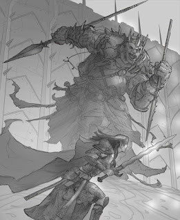
This was a full page image done for Dungeon Magazine. It features a Fomorian king taking on a female Eladrin knight in front of the high walls of his underground city. It was a challenging composition, any time you have to feature two characters facing off with one another, and one of them is 20 feet high (A challenge that is pretty common in D&D art actually) and I had to show them in a compact area!
My favorite solution for this kind of scene is a little layering and distance to show the difference in size and include both characters in the frame equally. I could have just put all the focus on the Eladrin, and just shown the Fomorian from the knees down, but that wouldn't have accomplished the goal, or been very action packed, so it became more about creating depth of field.
They wanted more of the bulging eye, mutant kind of look I had done for the Fomorians in the Monster Manual for fourth edition D&D. So I obliged with a follow up sketch, seen above.
The sketch was then approved, and I proceeded to airbrush in some greys to lighten the line work, define some of the highlights, cut out and shaded some of the armor and straps, and dropped in the base texture for the fomorians chain mail. I also started rendering the rim lighting on the Eladrin, and defined some of the shadows as well.
Here I am already just about finished on the Eladrin, having used much of the original sketch to create detail line work on the armor, and just brushed in additional shading and strengthened all the highlights and defined the edges.
For the Fomorian I was chopping out and filling the armor and main torso with their base tones before I started to render the bulk of the figure.
Here I was starting the add in the background detail, texture and coloring, as well as dropping in color on the Eladrin. I was just about done with the Fomorians multiple articulated armor plates and little bits of gear, and was laying in a little color in his different items and a light skin tone on the face as I worked in the little face details.
Here I finished coloring the Eladrin, and at this point she was pretty much complete. The Fomorian was also done with the basic rendering, and I had finished with the base coloring, and even done another pass of highlights and shadow work (this is usually necessary once I've added in all the colors, as some hues inevitably shift a little with color and need adjustment), as well as adding in the rim lighting
Here I have started to really finalize the coloring of both the scene and the characters. I also darkened in some areas around the left side of the image, to add contrast to the main scene, and lightened the background around the Fomorian and Eladrin both to pull them out of the image more. I also reduced the contrast of the ground to make it blend into the background.
Here I added a lot more contrast, the final highlights and light blooms off the reflective surfaces, and pulled up the saturation on the cyan, blues and yellows, while leaving the Fomorians skin tone unchanged, which helped mitigate the almost cartoonish purple color of the creatures skin and created the illusion of lower saturation by contrasting and surrounding it with complimentary, and equally saturated colors. I also dropped in a lot of scene texture and grit to add some noise, movement, and implied wear and tear. And its done!


