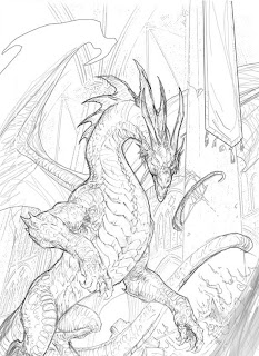
This was an Italian fantasy novel cover I worked on a years ago, and this is the original sketch as submitted to the client.

After doing some test layouts, the client asked for some changes due to the title and text placement that needed to go over the image. to accommodate, I moved the dragon into the center of the image, and shrunk him down just a little to create open space on the top, bottom, and sides.
Here I laid in a number of photo elements onto the background, following the perspective and lines of the sketch. I first turned the sketch to a multiply layer so I could orient the photo elements correctly, and not create any issues with the main figure.
I also added in some light airbrushing to indicate the lighting of the fires in the background before painting them in.
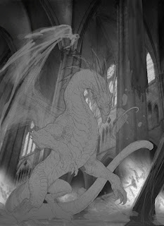
Here I cropped out most of the main figure, and lowered the contrast and color down to a mid-tone gray, in preparation for painting.

I then duplicated the main figure layer and changed it to multiply, which automatically brought the tones way down, and closer to the darker look of the final color for the scales.
This is where I started zooming in and refining the details down, and is probably the most time consuming part of the image. I was also pulling back on the contrast on some of the highlights to emphasize the flame as the light source, and not confuse the image too much.
As I began adding color, I didn't worry too much about how it looked right away, just laying in the basic hues to get a sense for where the color shapes were going, and trying to balance out the scene. I also added some more work to the background, finishing up the flames, and adding a few light rays to the background to help pull out the main figure, which I knew was going to be a priority early on when I got the description for a dark creature in a dark, indoor environment.
And here it is after I added textures, glow highlights, and played with the color for another hour or two. In retrospect, I probably added a few too many glow effects to the silhouette, but I was really having fun making the fins and wings look transparent, and wanted the area lighting to push that bright backdrop a bit more and reinforce the effect.


